
Case Study
Kido
Branding 1
PROJECT
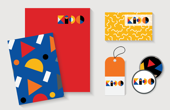
Shapes of Growth, Unity, and Balance
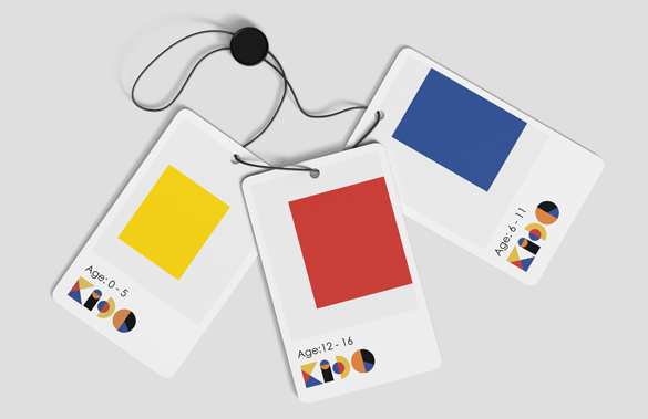
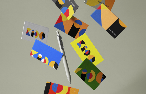
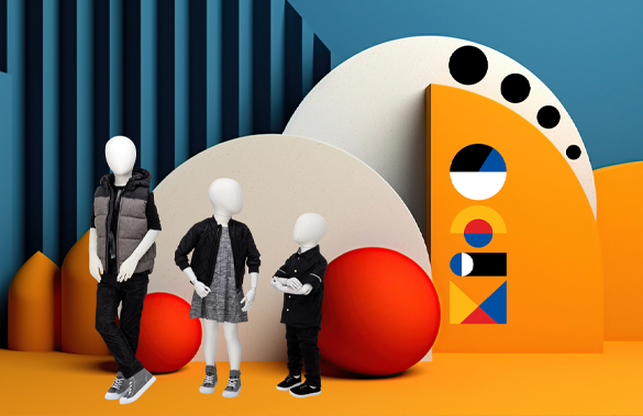
The logo concept revolves around the integration of fundamental geometrical shapes to create a visually appealing and meaningful representation for a brand targeting children aged 0 to 16 years old.
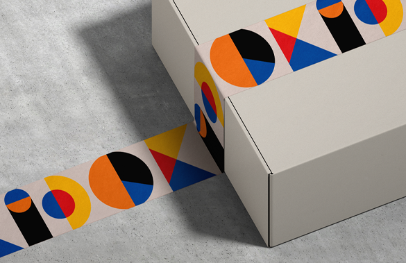
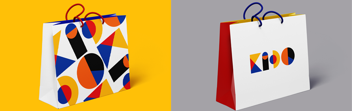
1. Circle: The circle represents unity and inclusivity.
2. Triangle: The triangle embodies progression and growth. It signifies the stages of development that children go through from infancy to adolescence.
3. Square: The square symbolizes stability and balance. It reflects the structured learning environment provided by KIDO, promoting a balanced approach to education, play, and social interaction.