
Case Study
Homemade
Authentic Cuisine
PROJECT
Where Warmth and Flavor Come Home
The logo conveys a sense of home, tradition, and care. The large house suggests a welcoming space, while the fork and spoon, bent into the shape of a smaller house, signify the authenticity and craftsmanship that goes into every dish. The small house within a house communicates that every aspect of the bakery is rooted in love and homemade goodness.
The overall design speaks to customers who seek wholesome, authentic, and thoughtfully prepared food in an atmosphere of warmth and care. The combination of familiar culinary tools and the house shape reinforces the concept of a bakery that feels like home, where every bite is a reflection of tradition and authenticity.
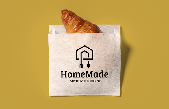
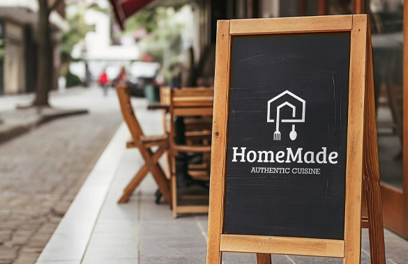
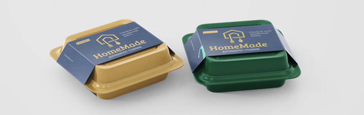
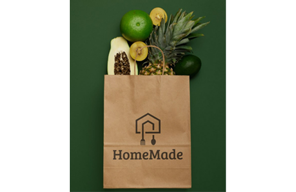
Homemade Authentic Cuisine creatively blends the idea of a house with a fork and spoon, forming a smaller house within the larger one. The design symbolizes warmth, homecooked authenticity, and the nurturing care that goes into every dish, creating an identity that feels both familiar and comforting.
Client
Homemade
Industry
Food & Beverage
Services
Brand Identity, Logo Design
A Recipe for Belonging
The Homemade brand represents more than just food—it's about creating a sense of belonging and comfort that transcends the dining experience. Every element of the brand speaks to the universal human desire for connection, tradition, and the simple pleasure of a meal made with love.
By ingeniously combining the symbols of home and dining, we've created an identity that immediately communicates authenticity, warmth, and the promise that every meal will feel like coming home.